Warning: A non-numeric value encountered in /home/wwwlives/livestreets.ru/docs/en/wp-content/plugins/slider-image/slider.php on line 2200

How ill-conceived parking policies ruin the pedestrian realm of the city
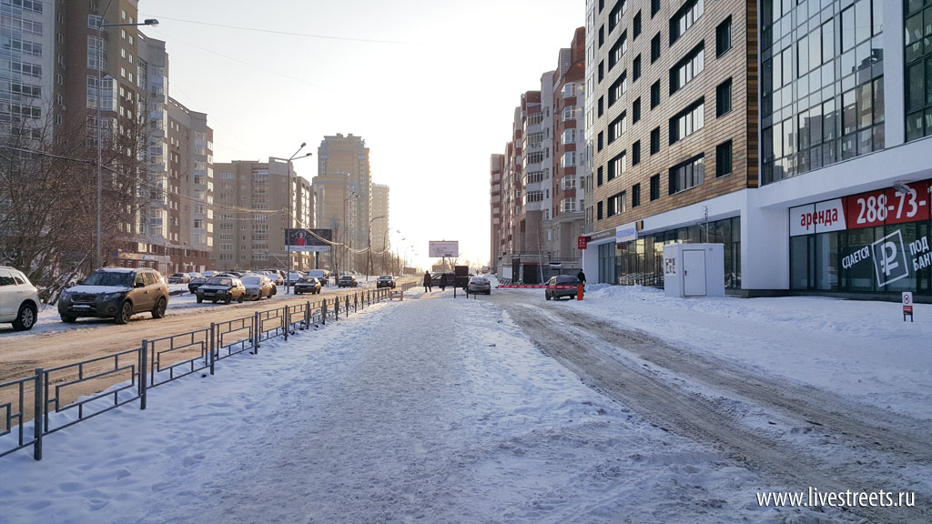
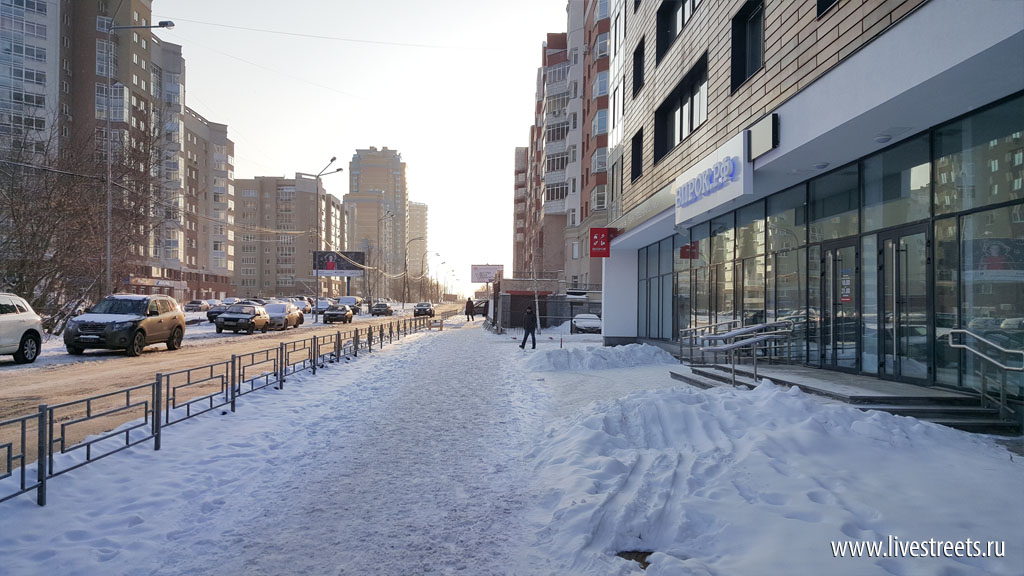
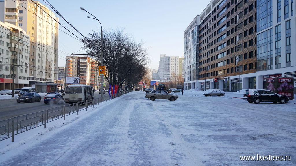
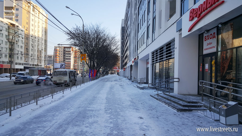
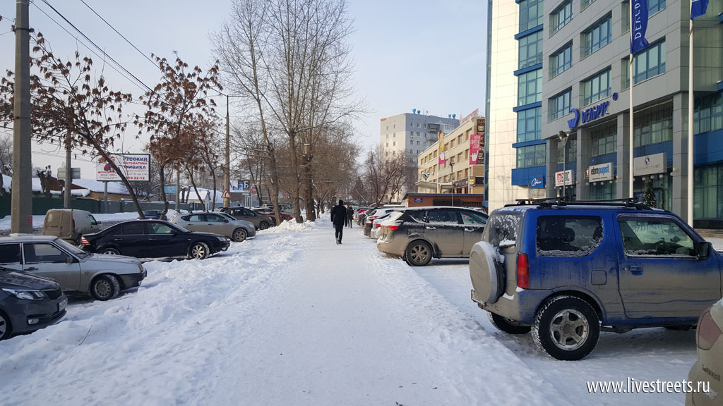
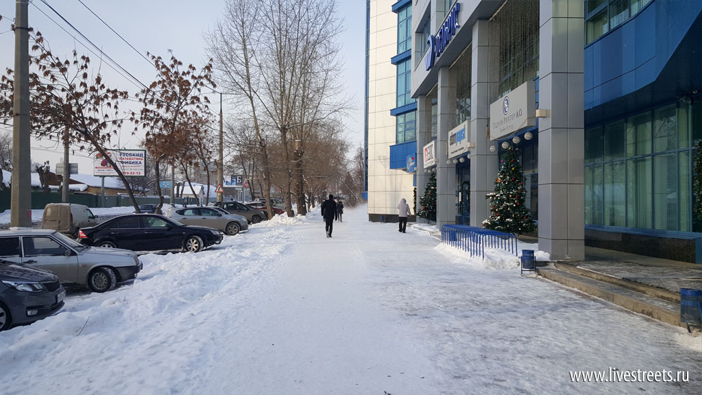
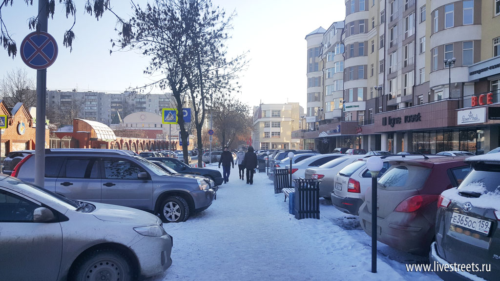
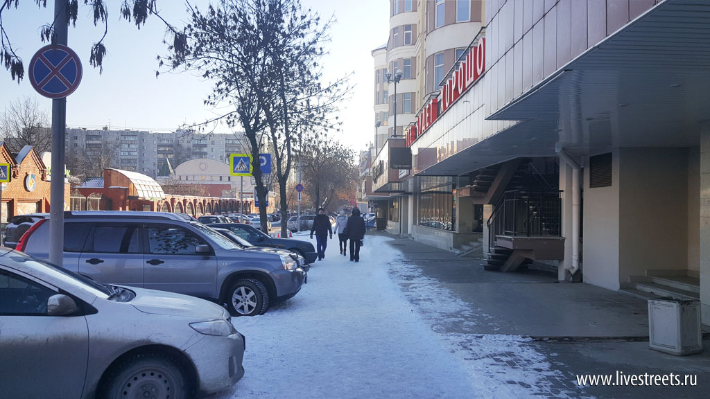
In my November post on street design I have pointed at certain features of modern Russian architecture that undermine the creation of good public spaces. Namely I mentioned deep setbacks between buildings and the right-of-way that are used as parking lots. Thus buildings face the street not with pedestrian-friendly frontages but with hoods and tailpipes of parked cars.
The difference between pedestrian-oriented and car-oriented development is not usually striking to a passer-by. It is a background that creates a certain atmosphere in the city or on particular streets. Like stuffiness in a room – one wouldn’t notice how stifling it was until the window is opened.
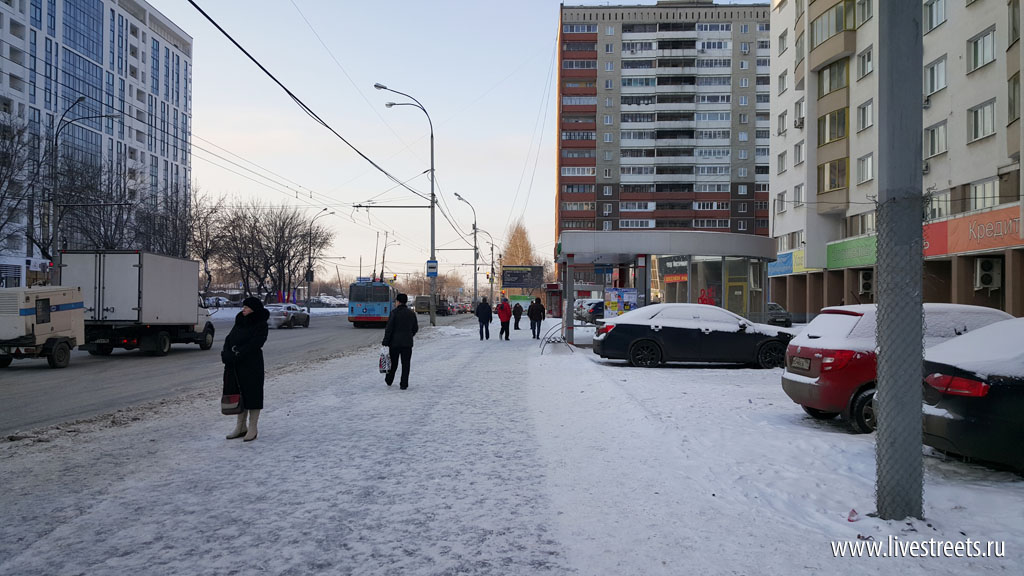
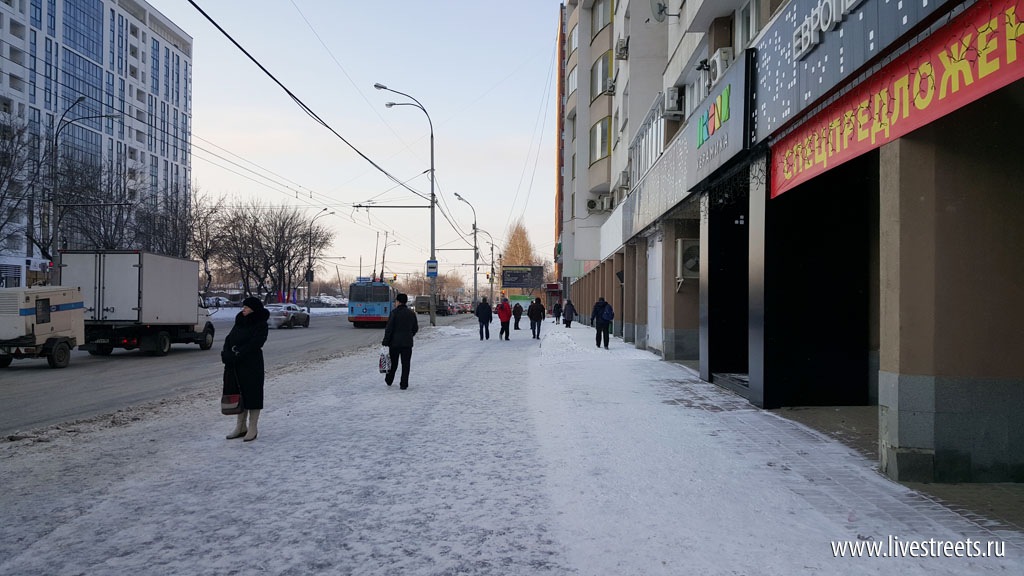
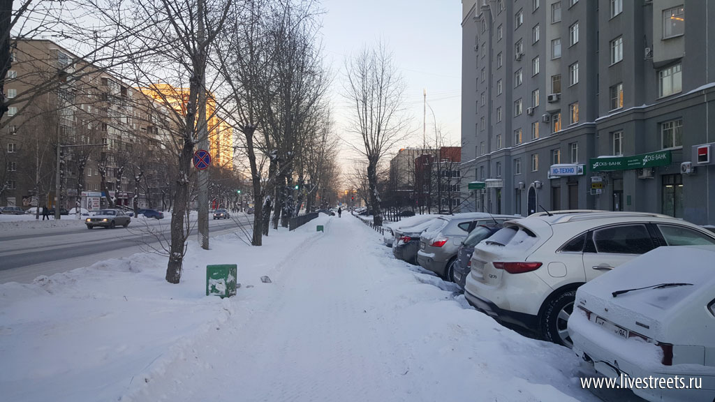
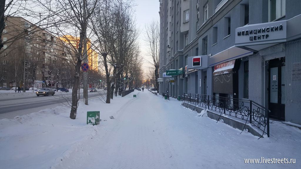
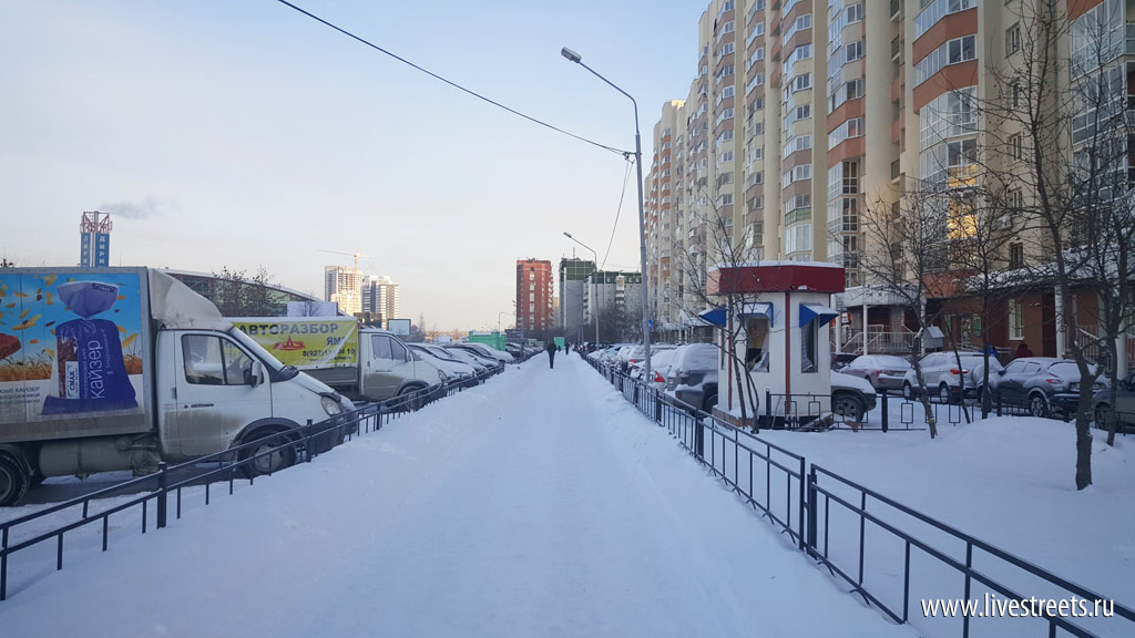
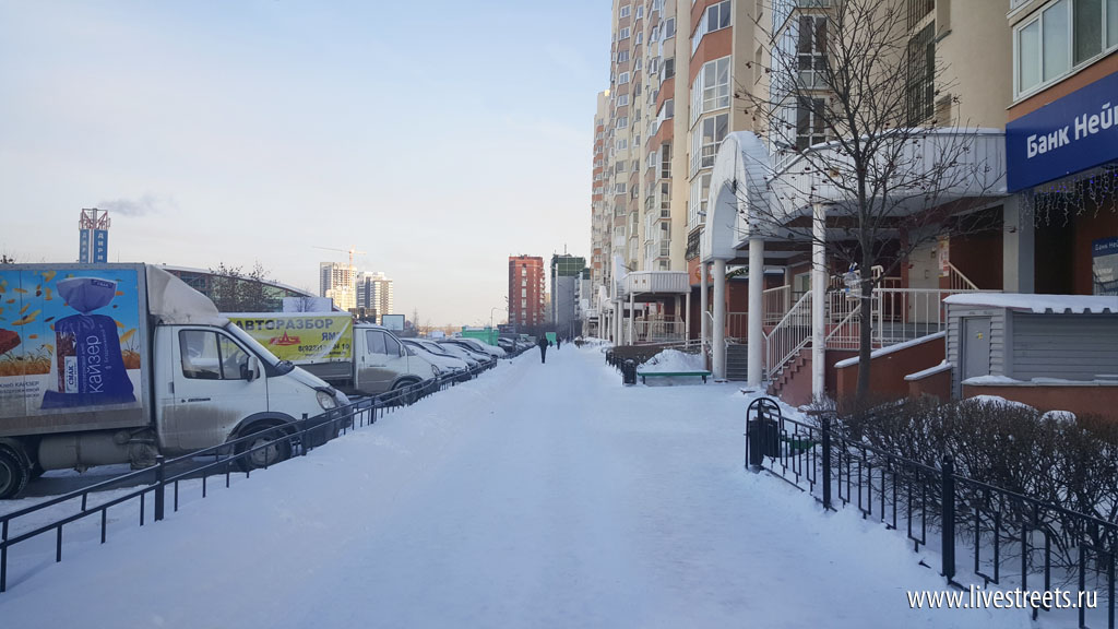
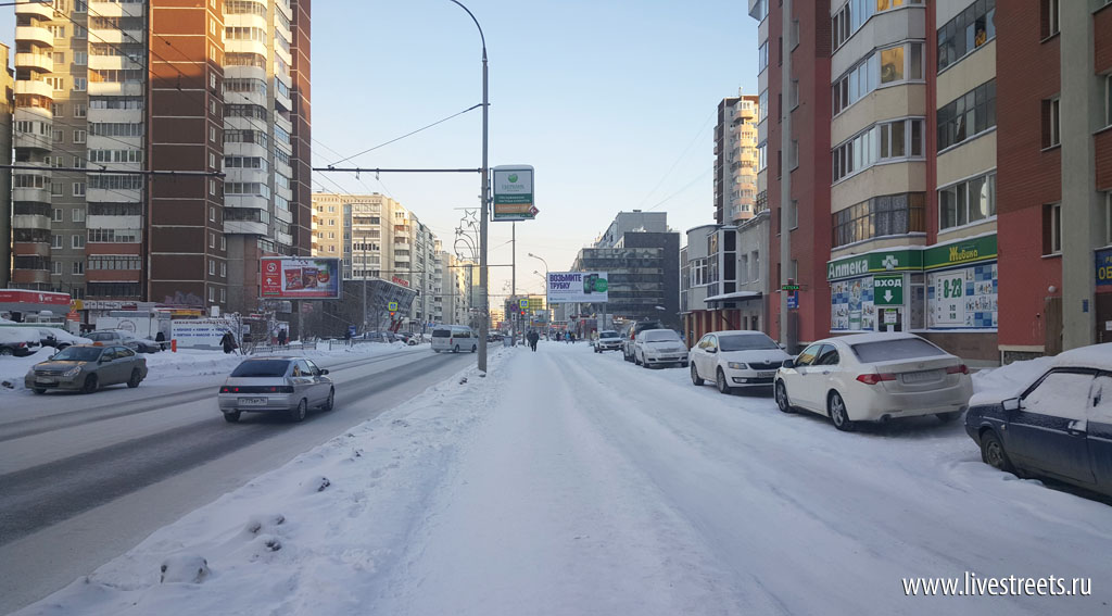
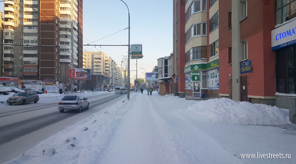
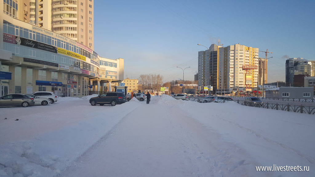
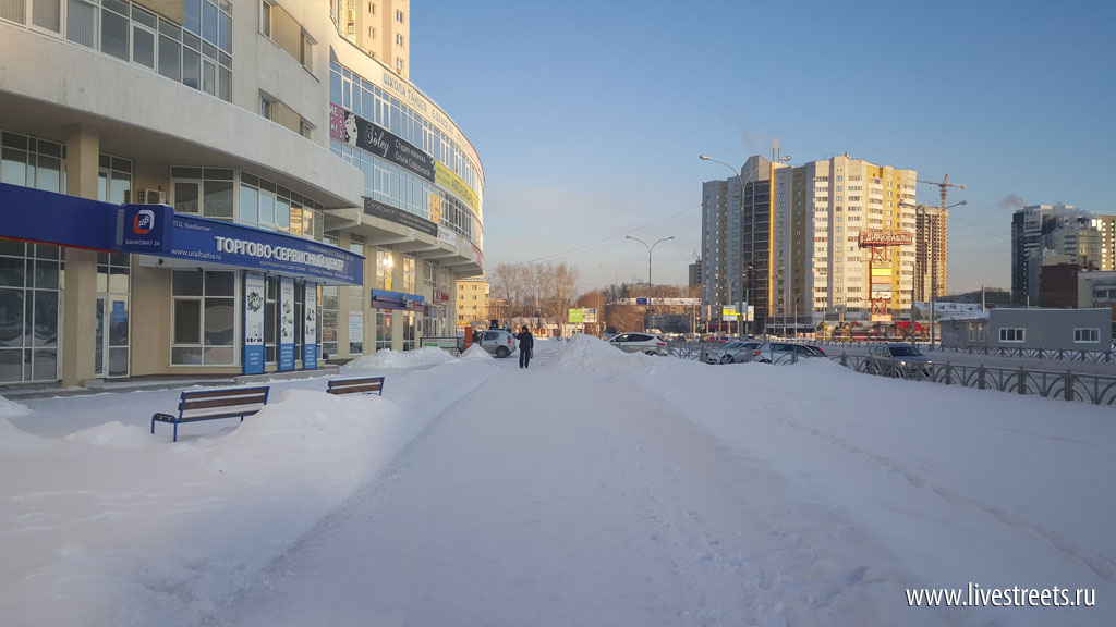
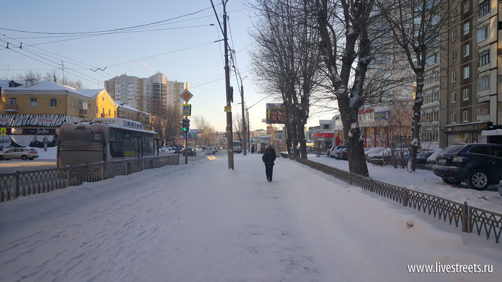
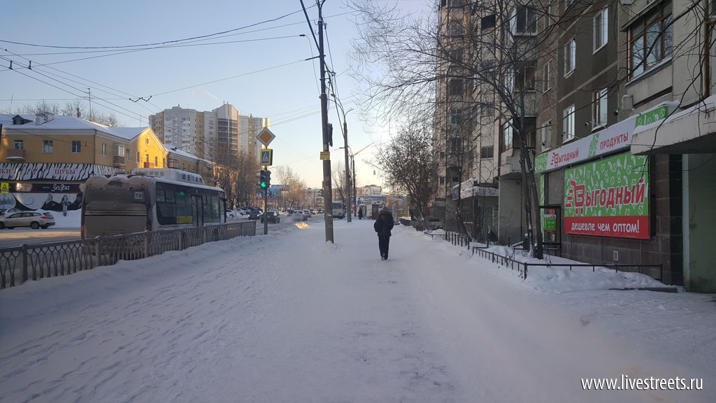
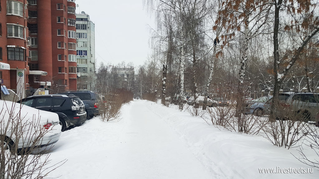
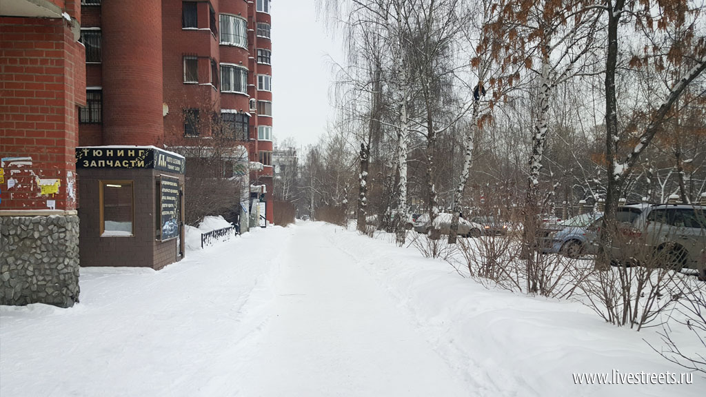
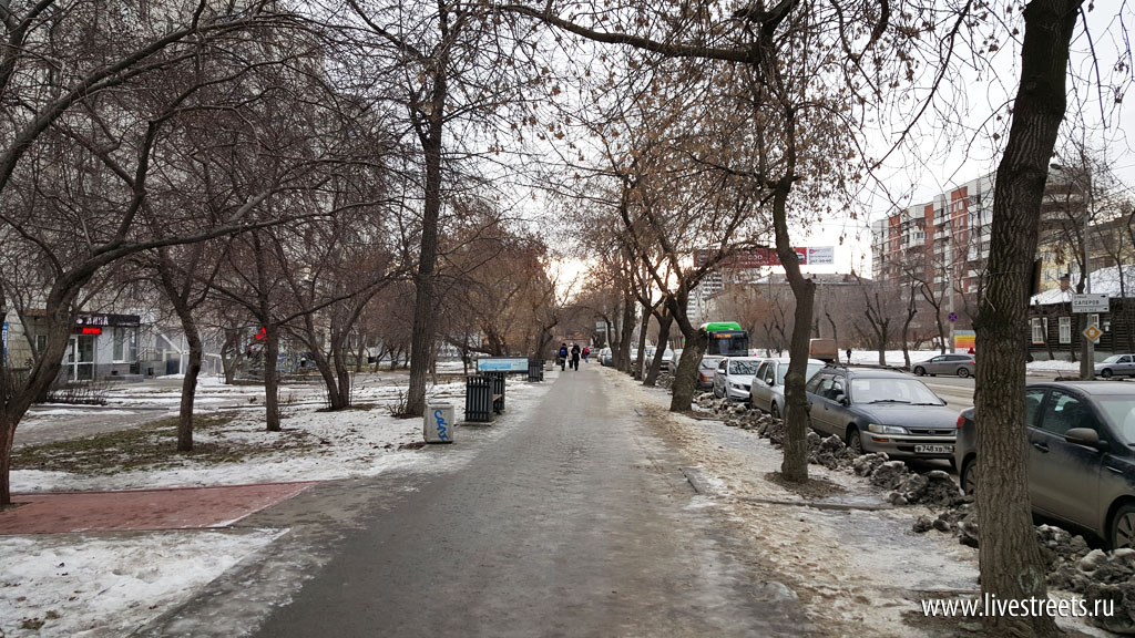
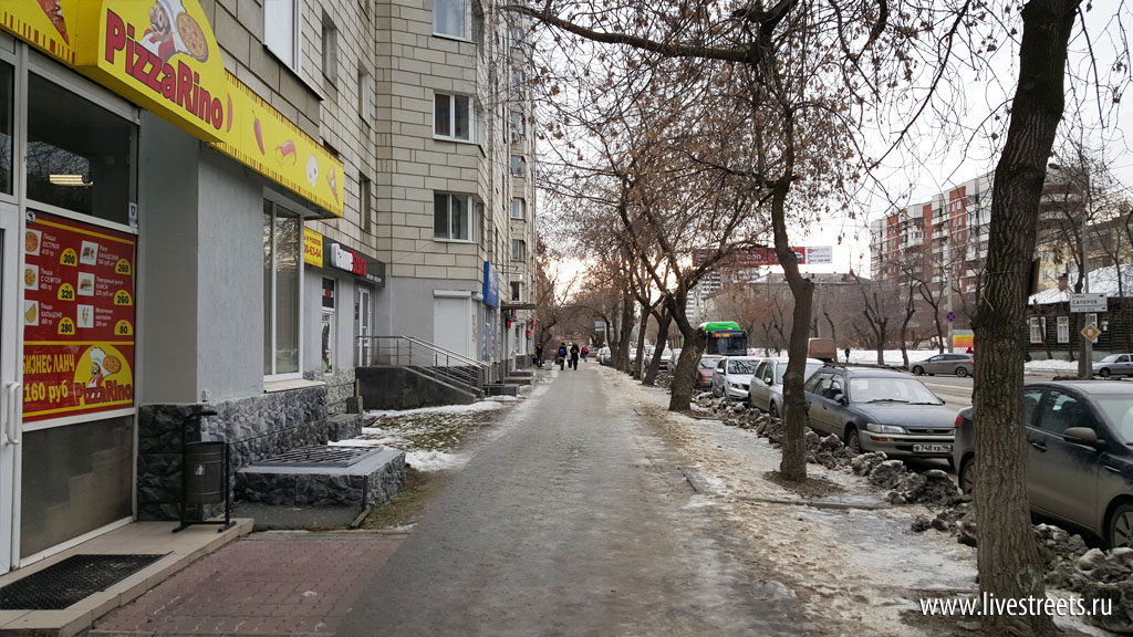
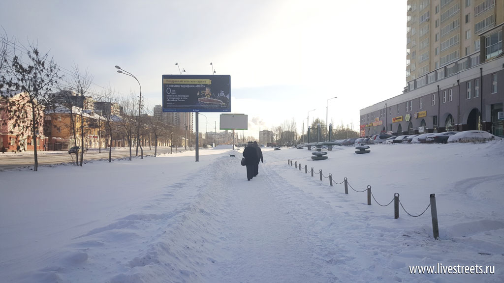
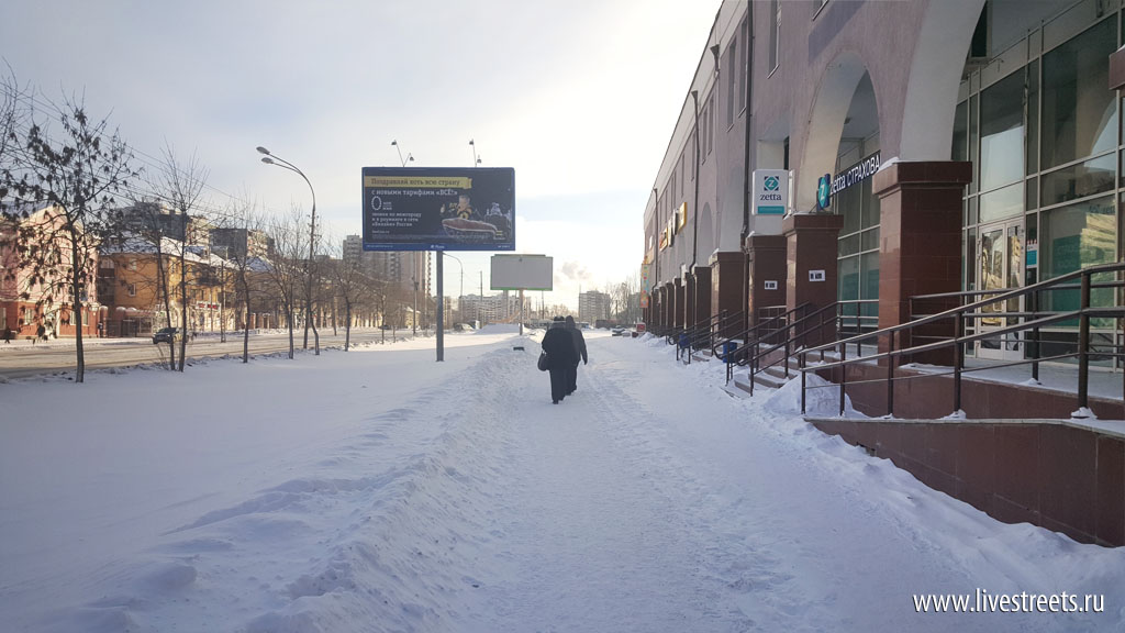
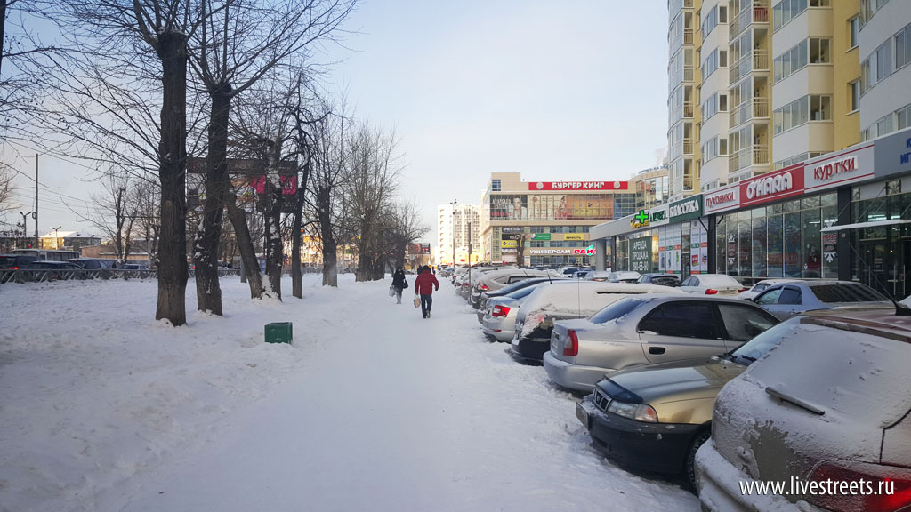
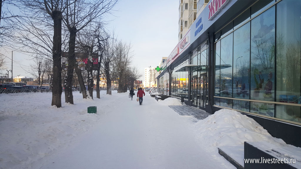
To ‘open the window’ and illustrate the difference between pedestian- and car-oriented buildings I’ve created pairs of photographs showing the same places but with different placement of buildings relative to the street. Let’s have a look!
Use arrows on images to switch between two versions.
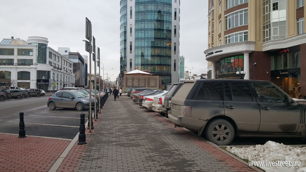
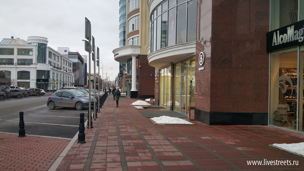
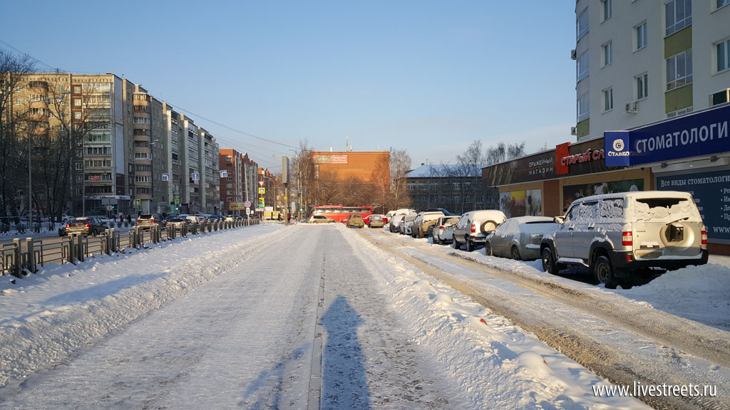
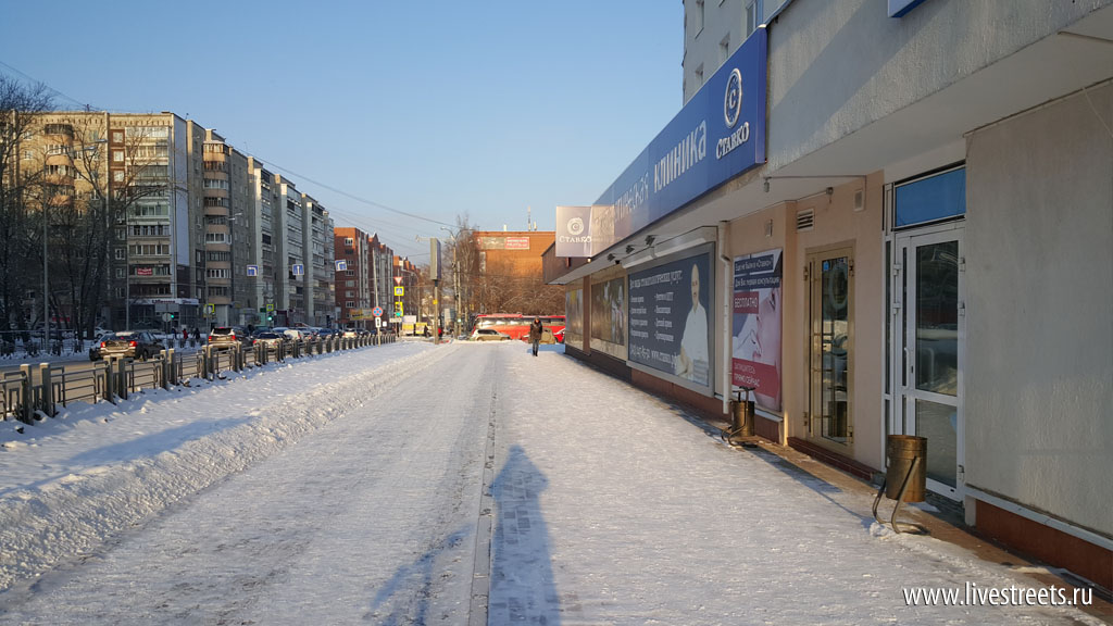
Good quality pavement and street furniture cannot make up for the lack of pedestrian-oriented frontage.
On streets in the historical center the loss of build-to line is particularly disappointing.
This driveway is dysfunctional even for cars. And it separates pedestrians from the building.
This space can hardly become pedestrian-friendly anytime soon.
Good architecture is clearly not enough to create a good pubic space. Correct building placement is just as important.
An older building across the street from the previous one.
This building might be classical in looks but it’s placement is clearly modernist i.e. with disregard to the street space.
What’s more attractive – walking between two fences or having a active building frontage on one side?
A neighborhood main street – not for pedestrians.
A corner of two streets is formed by a parking lot.
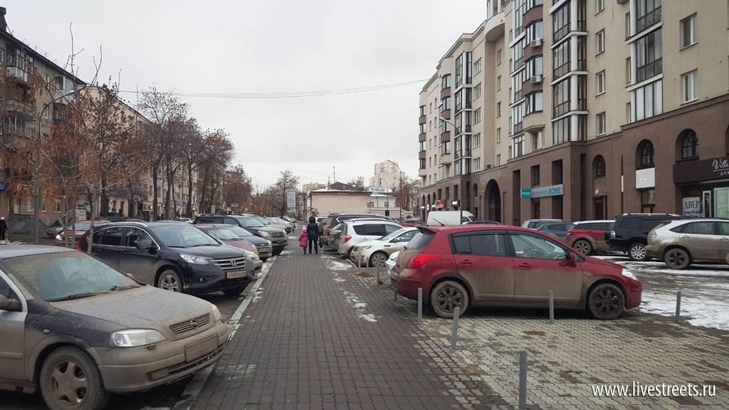
Late Soviet-era housing. Again car access is prioritized.
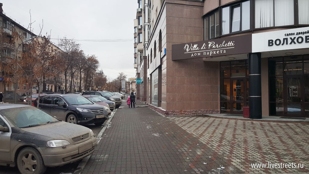
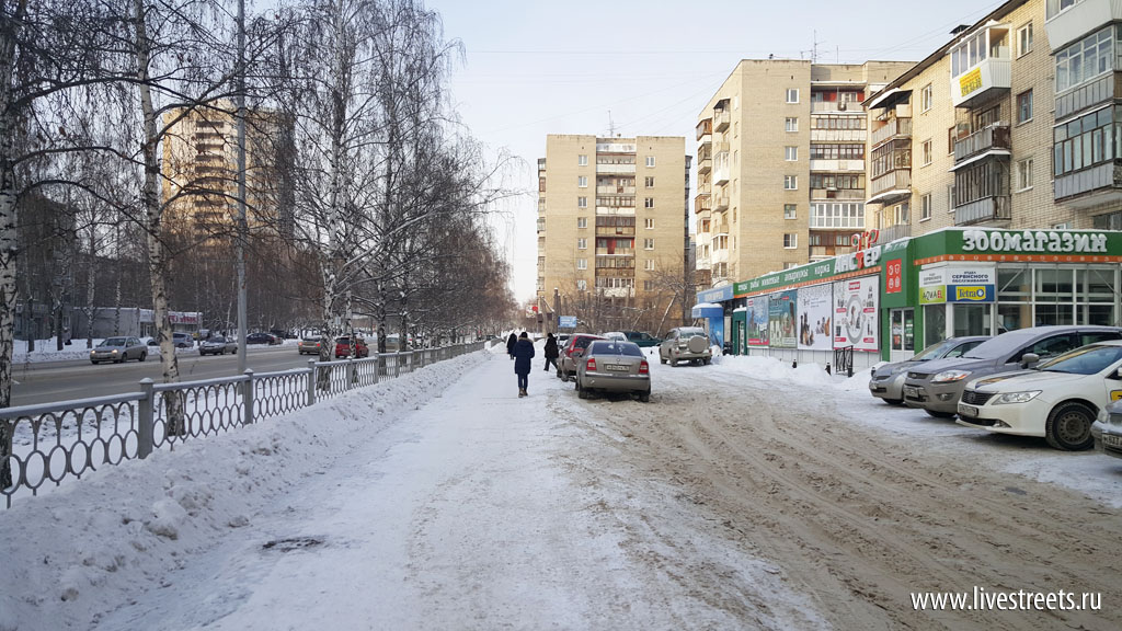
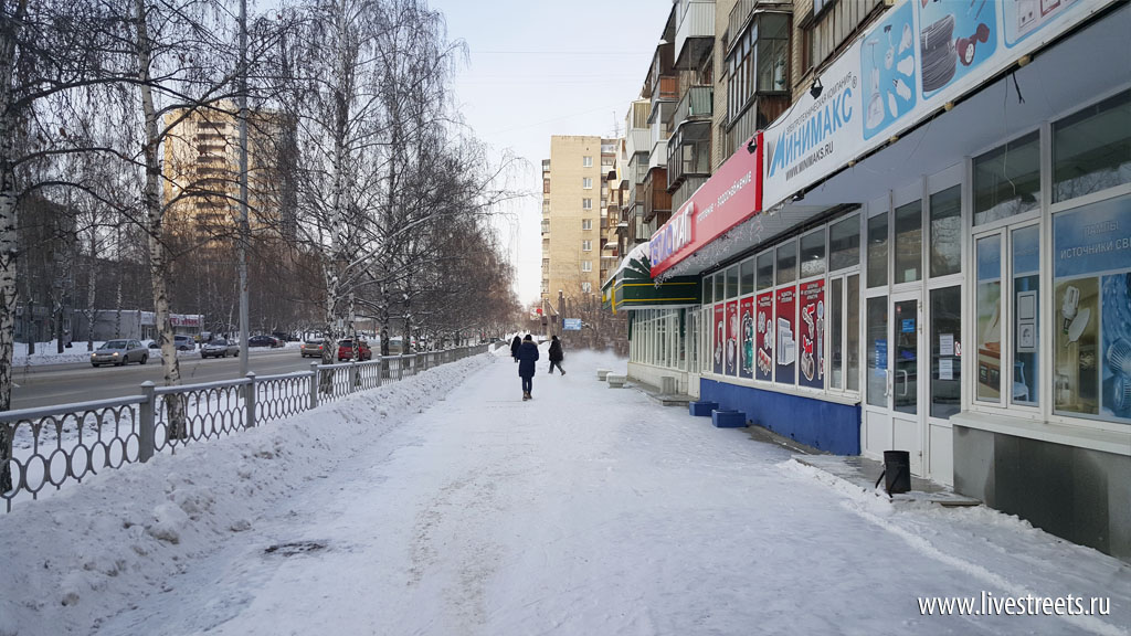
Shops on the ground floor are good. The problem is that you have to cross a parking lot to get to them.
There were many ways to place this small parking lot but the most primitive and pedestrian-unfriendly of them was chosen.
An office building on the same street.
Even an ugly frontage is better than bushes and cars.
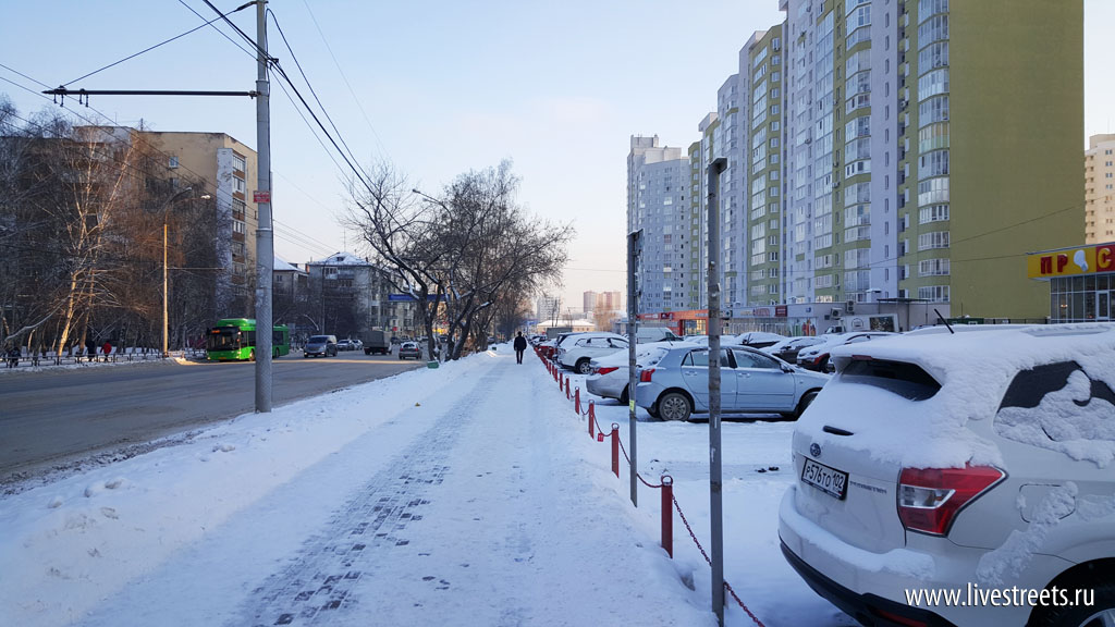
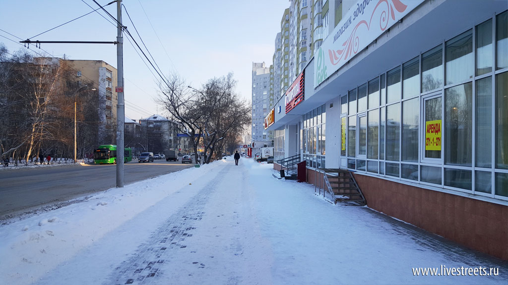
This buffer between two rows of parking can hardly be called a sidewalk.
The following examples might seem as controversial. The setback is occupied not by parking lots but by greenery. This was the way of building before new regulations raised the requirements for new parking spaces. If these buildings were designed today there would be parking lots in front of them.
I’m all for greener streets but I believe that trees should protect pedestrians from car traffic while streets should be shaped by buildings. If a building is placed too far from the sidewalk the space of the street starts falling apart.
New residential development – no respect for pedestrian space:
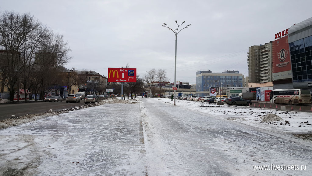
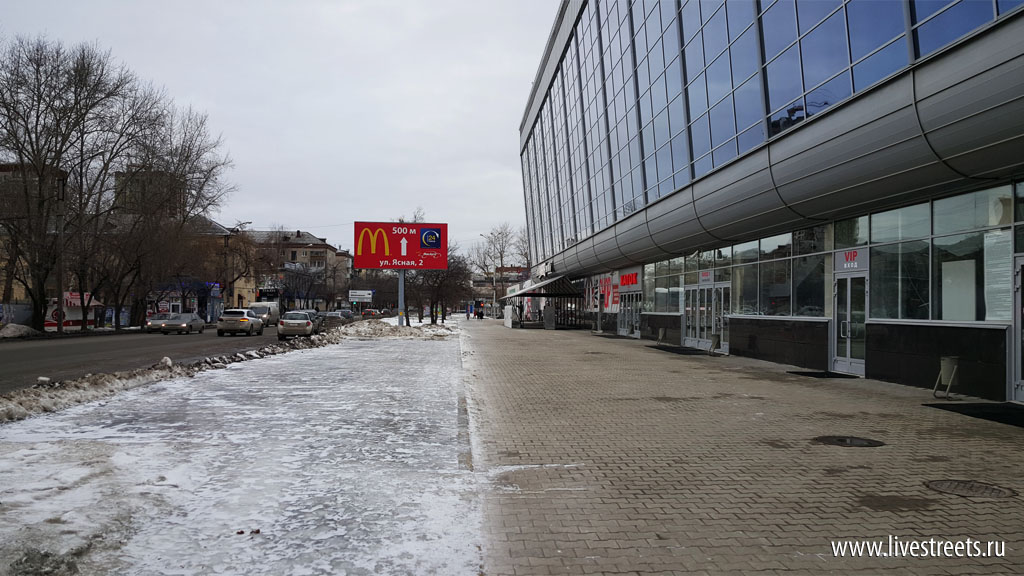
Another controversial example – a sports arena. I believe that parking lot could have been placed behind the building and the front could have faced a pedestrian plaza.
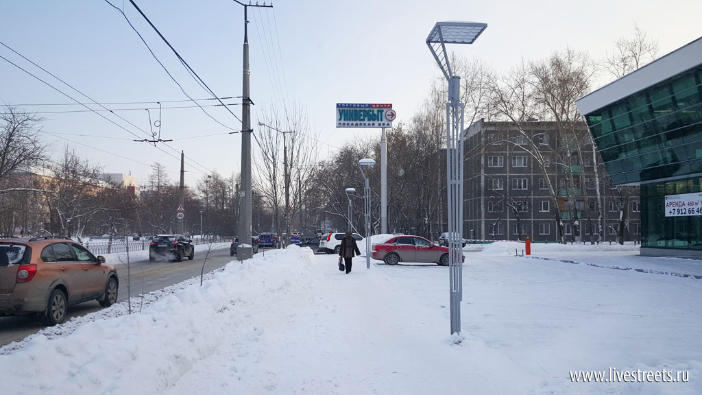
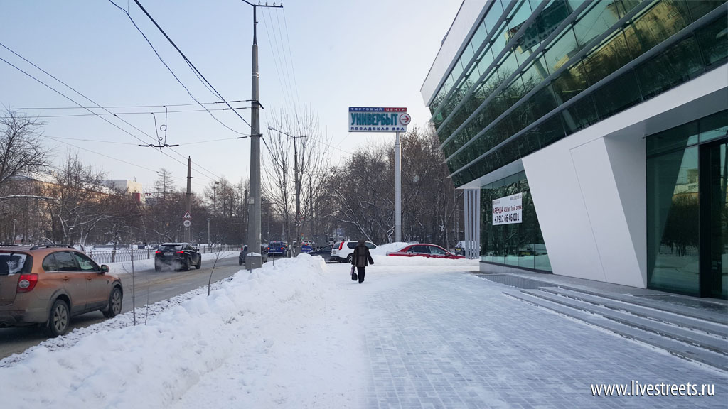
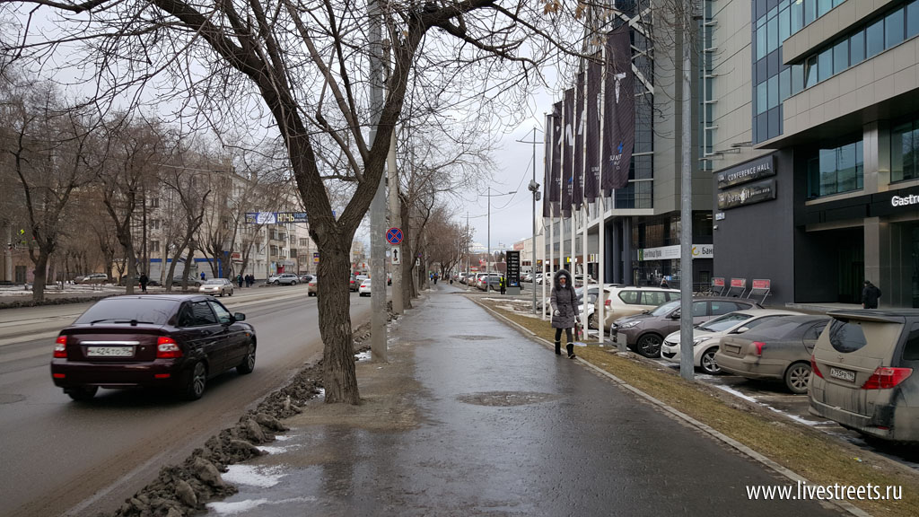
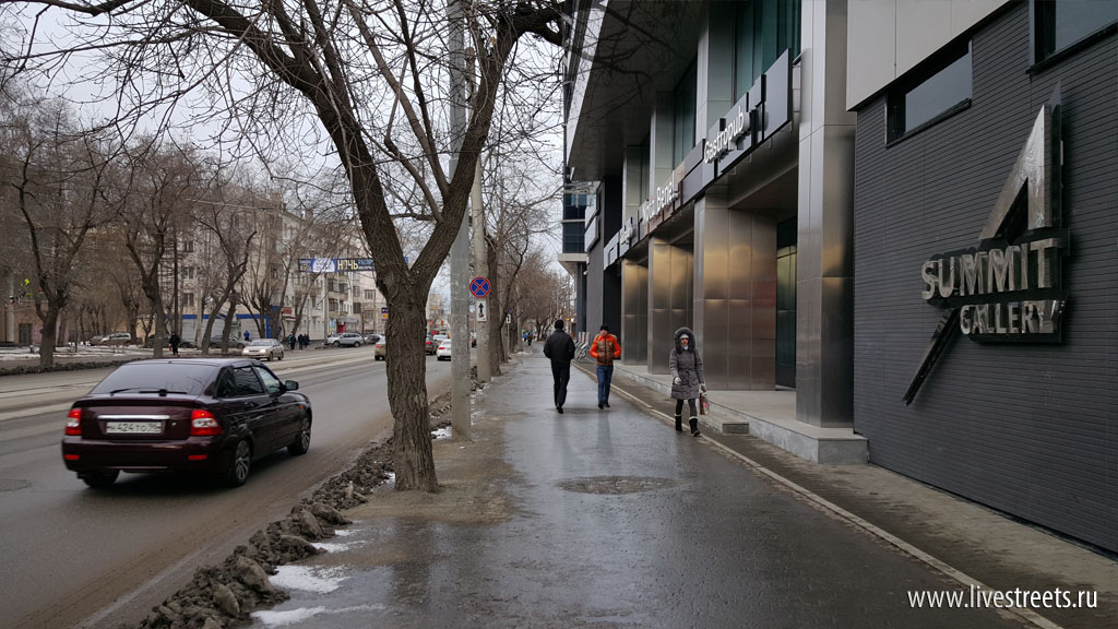
A major loss for pedestrian space – an office building in the center of Yekaterinburg with lots of pedestrian traffic in front but with total disregard to it:
The problem such develompent is that these mistakes are very hard and expensive to correct. And the result of such corrections would most likely be mediocre. In some cases it is possible to extend the ground floor or build a podium. In others a masking building could be built to face the sidewalk. Pedestrian plazas can also be created instead of the parking lots. Demolishing a building to build a new and proper one is in most cases too expensive. And that is tragic for the city. We disfigure our streets for decades to come in a short-sighted pursuit of more parking spaces.

